In this article, we are going to show you how to create a Funnel chart in Excel versions older than 2019 - including 365. Funnel charts are fairly popular among sales and marketing processes. You can use a funnel chart to display the progression of data through different phases. Unfortunately, Excel does have native funnel chart support, unless you are using Excel 2019 or have a Microsoft 365 subscription. This guide will show you how to use a workaround if you are using any of the older versions.
Creating a funnel chart
A funnel chart essentially looks like a bar chart, but with centered bars. Values in the series are usually sorted in descending order. Centered bars with decreasing widths can basically resemble a funnel.
We will use this similarity to create a “dynamic” funnel chart. We are calling it dynamic, because you can always use an inverted pyramid Smart Art to create a funnel-like structure. This visualization won’t expresses any values though.

A bar chart will give the dynamic behavior. Let’s continue with preparing our data.
Prepare the data
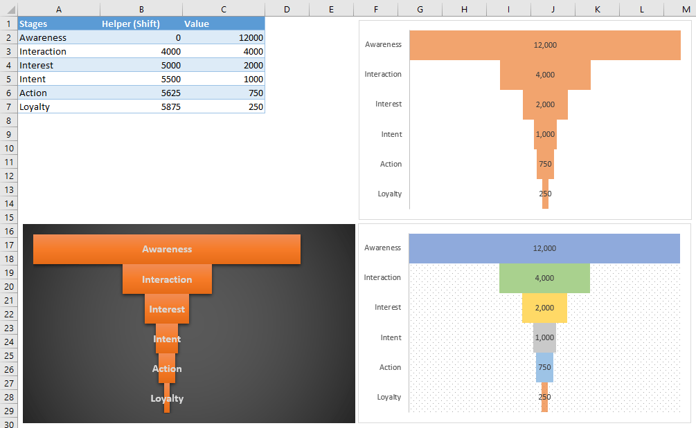
A funnel data is simple - you need the stages and the numbers represent corresponding values. Below is our sample data.

To centered the Value bars, we need a helper column to shift them to the right. The helper column will contain formulas which calculate how much a bar is to be shifted.
The formula is very easy - it calculates the half of the difference between maximum value in our dataset and the corresponding stage value. For example, if maximum stage value is 12,000 and 3rd stage’s value is 5,000, the shift value will be (12,000 - 2,000) / 2 = 5,000.
Let’s see this on an example.

Tip: Placing the helper column between Stage and Value columns will ease the process while creating the chart. On the other hand, you can place it anywhere and set column manually in chart settings.
Create stacked bar chart
Now that the data is ready, the next step is to create a stacked bar chart. Select your data and create a stacked bar chart.
Insert > Insert Column or Bar Chart > 2-D Bar > Stacked Bar
Note: It must be a stacked bar chart to give the effect of shifting.

Next, we need to configure some settings to make our bar chart look like a funnel.
Reverse the Order of the Categories
- Right-click on the vertical axis (stage names)
- Click Format Axis

- Format Axis pane will be visible. Check Categories in reverse order This action will make our chart upside-down.


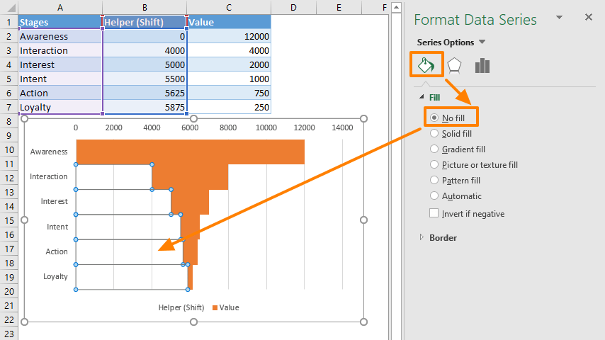
Hide Helper Column Values
- Right-click one of the helper column bars. Make sure every one of them is selected.
- Click Format Data Series (You can skip this if the chart options pane is already open).

- In Series Options section, set Gap Width to 0 to make the bars adjacent.
- Open Fill & Line section
- Enlarge Fill options
- Select No Fill to hide Helper column’s values


Final touches
After reversing the stages and hiding the helper bars, the bar chart starts to look like a funnel. Let's now take a look at some methods for further enhancing the look-and-feel of the chart.
- Remove the excess items. Select them and press delete,
- Legend
- Gridlines
- Value-axis
- If your maximum number stays the same, set it as the axis maximum to get rid of excess area on the right.

- Add Data Labels
- Color the bars