A histogram is a visual representation of the distribution of numerical data. Grouping data into specific percentiles can give you a better overview of the big picture. You can create an Excel histogram in two ways:
- Using formulas
- Analysis ToolPak add-in
Excel Histogram using Formulas
The FREQUENCY formula calculates the values in a structure that is required for a histogram. It calculates how often values occur within a specified range. This formula requires bins values, and the first thing we need to do is calculating the bins.
- Determine number of intervals. This is optional, but more steps increase the precision level. Too many steps might make it harder to read the results. We choose 21 for our example.
- Calculate the minimum of values. =MIN($G$3:$G$1002)
- Calculate the maximum of values. =MAX($G$3:$G$1002)
- Calculate the difference between the minimum and maximum. =max-min
- Calculate the bin size. =diff/(interval_count-1)

Since we know the start point (minimum value) and the bin size, we can create our bins.
- The first bin is the minimum value. =min
- Select the cell below and add the value above the bin size. =K8+binsize
- Copy down the cell for 20 intervals.

You can use the bins values for a Data Analysis Histogram as well. Next is using the FREQUENCY formula.
- Start by selecting the empty range next to the bins. (L8:L28)
- Type in the FREQUENCY formula, using the simulation results and bins values as arguments. =FREQUENCY(results,bins)
- Press the Ctrl + Shift + Enter key combination (instead of pressing the Enter key) to enter the formula.

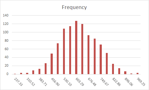
This will create the histogram. You can see that the majority of scenarios are gathered around the middle area of the chart. This is where the most likely results lie. To see the results in an easier to read format, you can graph this data.
Excel Histogram using Analysis ToolPak
The Analysis ToolPak add-in is a handy tool that is frequently used for data analysis. It is a ‘hidden’ add-in - it’s not active in Excel by default. You can activate it from the Add-ins dialog from FILE > Options > Add-Ins. Here, select Excel Add-ins in the Manage dropdown and click the Go button. Select the Analysis ToolPak and click OK.

The tool can be found under the DATA tab after activation, with the name of Data Analysis. You will see the Histogram option in this dialog. Selecting it and clicking OK opens the Histogram window.

In the Histogram dialog, Input range and Bin range should be selected. The Input range can be set to the results of the simulation. The Bin range is the numbers that specify the limits of each interval. You can use static numbers, or calculate them with formulas to make them dynamic. The Histogram dialog allows selecting a target location to create the chart.

Unfortunately, the Histogram in Data Analysis is not dynamic, and you have to open the Histogram dialog every time when working with a new set of data.