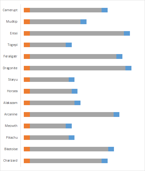
A pill chart is a fancier way of drawing bar or column charts. Rounded corners and space after axis are enough to make your dashboards catchier. In this guide, we’re going to show you How to create pill charts in Excel.
Raw data
The following table is our example dataset.

Actual data values cannot offer more than regular bars or columns. You need helper columns to keep the data for spaces and rounded edges to create a pill chart in Excel.
Generating data for helper columns
A pill bar or column has five parts:

- Starting Space: A placeholder value to give hovering effect
- Starting Edge: First rounding part
- Actual Value: Value from the source dataset
- Ending Edge: The last rounding part
- Ending Space: A placeholder value to give hovering effect
Each part requires its own column and values. The values for space and edge are made up numbers which you may need to try different values for you. Also, keep them same for each data rows to be consistent between data series.
These are our numbers. the order of the columns will ease the chart creation process since this is the order we want.

Creating pill charts
1. Add chart
Start by creating a stacked bar or column chart from the data with helper columns.

2. Remove unnecessary elements
Once the chart is ready, remove the legend and the value axis items. You can either click on the object and press Delete button or use the Chart Elements (Plus at the right side) button to remove them.

3. Make space parts transparent
Click on Starting Space parts on the column chart. Make sure each of them is selected. Right-click on them and select No Fill as a Fill color.

Apply same approach for the Ending Spaces as well. These invisible spaces gives enough gaps for hovering affect.
4. Rounding Edges
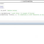
This is where magic happens. You might have already known that there isn't any rounding option for chart bars. However, you have the option to use an object as a background. Fortunately, the Delay object for Flowcharts is a perfect match for the job:

You can find and add the Delay object under the Shapes section of the ribbon.

Once the Delay shape is added, update it's coloring according to your style. Removing outline is a good approach to supply seamless visual.
After finishing, select and copy it. Select the suitable Edge part, e.g. right-pointing object to Ending Edge and paste the object.

5. Formatting
It's time for design updates to enhance the look of the pill chart. Matching colors is essential to make it look like a pill. Decreasing the gap between bars or columns increase the width of objects.

The most important addition is the Data Labels if you want to express actual values on the chart. Because of the helper columns, the visual cannot provide the precise values and differences between bars. Adding Data Labels removes this issue.
Select the actual data parts on the chart and use the Chart Elements button to add the Data Labels.