A Tornado Chart is a fancy form of a bar chart. They shine when the goal is to compare two variables. Although Excel doesn't support tornado charts natively, they are a few simple steps far away from you. In this guide, we’re going to show you How to Create Tornado Charts in Excel.
Data
A tornado chart makes sense when you want to compare two dependent variables side-by-side among different types of data or categories. Thus, a regular 3-column dataset, with categories and variables.
| Charizard | Magmar | |
| HP | 78 | 65 |
| Attack | 84 | 95 |
| Defense | 78 | 57 |
| Sp. Attack | 109 | 100 |
| Sp. Defense | 85 | 85 |
| Speed | 100 | 93 |
Once your data table is ready, it is time for the most important step. You need to convert the values of one of the variables to negative numbers. Apply this change to the values which you want to see on the left hand of the tornado.
Although making a negative action can be done manually, we will create a helper table and just multiply the values by -1.

Now, we are ready to create a tornado chart.
Creating a Tornado Chart
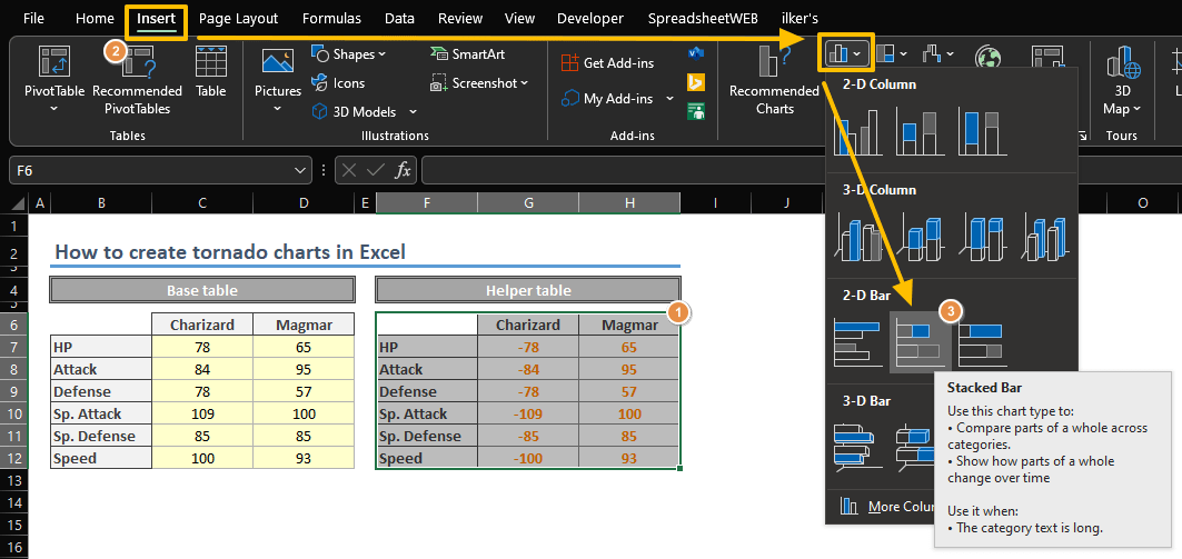
- Select the data that contains both negative and positive values.
- Create a Stacked Bar Chart by following the path Insert > Charts > Insert Column or Bar Chart > Stacked Bar Chart.

Although these two steps are enough to create a basic tornado chart. Consider a few tweaking steps to polish your chart.
- Start by changing or removing the title according to your needs.

- Consider moving the vertical axis to the sides by changing the Label Position for Vertical Axis.
- Move the legend and the horizontal axis to the upper side. This will improve the look and feel of your chart. Use the Chart Elements icon at the top-right of your chart.