Adding symbols or icons into charts can enhance the visual representation, and make it easier to understand the data. In this article, we are going to show you how to use symbols on charts in Excel.
Adding symbols to Excel
Note that you can always copy a symbol from an external source, and most symbols will work as expected. Let’s see how you can add a symbol into your worksheets in Excel.
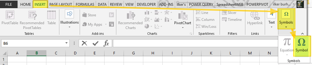
You need to open the Symbol dialog to see available options and add what you need.
- Start by selecting the cell where you want to insert the symbol
- Activate the Insert tab
- Click on the Symbol icon in the section Symbols

From this dialog, you can choose the symbol you want and insert into the active cell using the Insert button. For example, arrow symbols can be helpful for visualizing trends in your data.
You can find arrows under the Arrows subset. Different fonts contain symbols with different look-and-feel (especially symbol-based fonts like Webdings or Wingdings). Here are 2 examples:
Arial - Arrows:

Wingdings:

We will continue with using the Arial arrows in our examples.
Using symbols in your data
There are a couple ways you can add symbols into your chart data. You can add the symbols as is, without them changing dynamically. However, if your symbols indicate a change based on the values, this may not make sense.
For a dynamic structure, you can either use number formatting or formulas. The IF function can be enough in most cases if you only have 2 symbols. If you have more than 2 symbols, VLOOKUP works better.
In this guide, we will mainly be looking at the number formatting method. Excel allows creating your own number formatting beyond adding decimal points or changing currency symbols. You can inject a strings or symbols into the formatting and make Excel display them based on the cell value. A good example is using an up-arrow (↑) for positive numbers, and a down-arrow (↓) for negatives.
Let’s see how you can add symbols into number formatting.
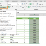
- Select the cells of values you want to modify. We added a column that shows the total of each row.
- Press Ctrl + 1 to open the Format Cells dialog
- Activate the Number tab
- Select Custom from the Category box
- Add or type in your number formatting into Type. The following example separates positive and negative numbers with a semicolon (;). Also, note that negative numbers do not contain a minus sign (-).
↑#,##0.00;↓#,##0.00 - Click OK button to apply the formatting.


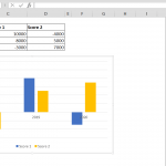
This is the result:

Using symbols on charts
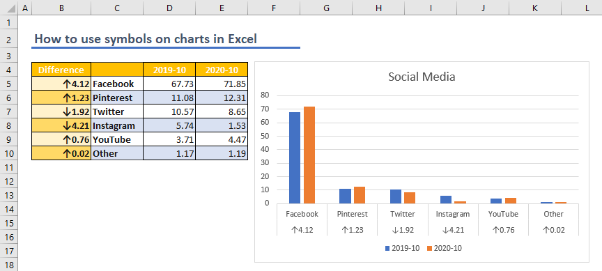
Finally, we can begin using symbols on charts. We added a total column at the left of the label column. This structure makes Excel evaluate the total column as part of labels. Thus, we can see both the totals and symbols along with the labels.
To add a chart;
- Select the data range
- Activate Insert tab in the ribbon
- Click the icons of the chart you want. We preferred a clustered column chart for this post.


That's it!