A pie chart is a graphic representation of data on a circle divided into a number of slices. Each slice is drawn proportional in size to represent the contribution of each item to the whole. Note that pie charts can only show single series of data, and are best used with data that doesn’t contain too many categories - The chart can become hard to interpret if it has too many slices. Pie charts commonly used in dashboard reports, and are great for creating an overview of underlying items.

Excel has a plethora of options for pie charts that you can choose from. Let us show you how to make a pie chart in Excel and use them in your dashboard reports! You can download our sample workbook here.
Pie Chart Basics
Sections

A pie chart has 3 main sections:
- Plot Area: This is where the graphic representation takes place.
- Chart Title: The title of the chart. It’s always a good idea to enter a descriptive label to define the chart.
- Legend: The legend is an indicator that helps distinguish between data categories.
Types

There are 5 types of pie charts:
- Pie: Default representation of a pie chart.
- 3-D Pie: A 3D variation of the pie chart. 3-D may not always provide a good representation of the data due to the distorted perspective.
- Donut: The pie charts with a hole in the middle, very much like a donut. The main advantage of a donut chart is its ability to display multiple series at once. A donut chart may provide a better data intensity ratio than standard pie charts.
- Pie of Pie: A pie of pie chart can show more data without reducing the size of each slice. The smaller values are combined into one slice in the main pie, and they are shown inside another small pie chart.
- Bar of Pie: Another variation of the Pie of Pie chart. In this version, a single bar column is used instead of a smaller pie.
How to Make a Pie Chart in Excel
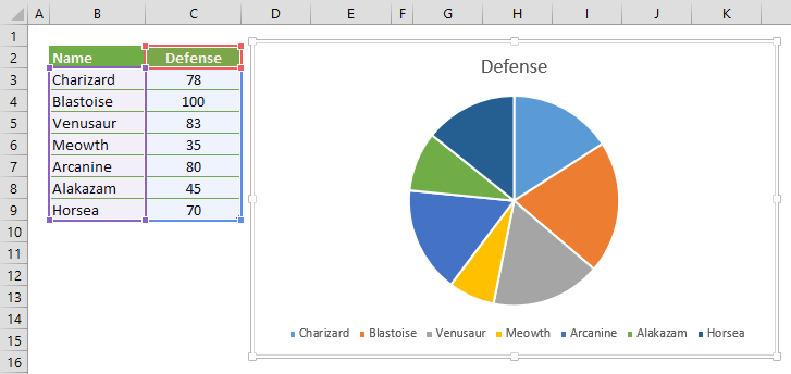
Start with selecting your data in Excel. If you include data labels in your selection, Excel will automatically assign them to each column and generate the chart.

Go to the INSERT tab in the Ribbon and click on the Pie Chart icon to see the pie chart types. Click on the desired chart to insert. In this example, we’re going to be using Pie.

Clicking the icon inserts the default version of the chart. Now, let’s take a look at some customization options.
Customize a Pie Chart in Excel
Customizing a Chart Methods
You can customize pretty much every chart element, and there are a few ways you can do this. Let’s look at each method.
Double-Clicking
Double-clicking on any item in the chart area pops up the side panel where you can find options for the selected element. Please keep in mind that you don’t need to double click another element to edit it once the side panel is open, the side menu will switch to the element. The side panel contains element specific options, as well as other generic options like coloring and effects.

Right-Click (Context) Menu
Right-clicking an element will display the contextual menu, where you can modify basic element styling like colors, or you can activate the side panel for more options. To display the side panel, choose the option that starts with Format. For example, this option is labeled as Format Data Series… in the following image.

Chart Shortcut (Plus Button)
In Excel 2013 and newer versions, charts also support shortcuts. You can add/remove elements, apply predefined styles and color sets and filter values very quickly.
With shortcuts, you can also see the effects of options on the fly before applying them. In the following image, the mouse is on the Data Labels item and the labels are visible on the chart.

Ribbon (Chart Tools)
Whenever you activate a special object, Excel adds a new tab(s) to the Ribbon. You can see these chart specific tabs under CHART TOOLS. There are 2 tabs: DESIGN and FORMAT. While the DESIGN tab contains options to add elements, apply styles, modify data and modify the chart itself, the FORMAT tab provides more generic options that are common with other objects.

Customization Tips
Preset Layouts and Styles
Preset layouts are always a good place to start for detailing your chart. You can find styling options from the DESIGN tab under CHART TOOLS or by using the brush icon on Chart Shortcuts. Here are some examples:
Applying a Quick Layout:

Changing colors:

Update Chart Style:

Changing chart type
You can change the type of your chart any time from the Change Chart Type dialog. Although you can change your chart to any other chart type, in this example we’re going to focus on Pie chart Excel variations.
To change the chart type, click on the Change Chart Type items in Right-Click (Context) Menu or DESIGN tab.

In the Change Chart Type dialog, you can see the options for all chart types with their previews. Here, you can find other pie chart types like Donut and 3D variations. Select your preferred type to continue.

Switch Row/Column
By default, Excel assumes that vertical labels of your data are the categories, and the horizontal ones are the data series. If your data is reversed, click Switch Row/Column button in the DESIGN tab, when your chart is selected. Keep in mind that pie charts, except for donut, are not suitable to show multiple data fields after row-column switching.

Move a chart to another worksheet
By default, charts are created inside the same worksheet as the selected data. If you need to move your chart into another worksheet, use the Move Chart dialog. Begin by clicking the Move Chart icon under the DESIGN tab or from the right-click menu of the chart itself. Please keep in mind you need to right-click in an empty place in chart area to see this option.

In the Move Chart menu you have 2 options:
- New sheet: Select this option and enter a name to create a new sheet under the specified name and move your chart there.
- Object in: Select this option and select the name of an existing sheet from the dropdown input to move your chart to that sheet.


