A radar chart is a graphic representation using lines placed on axes that diverge from the center of the chart. A radar chart is very useful for visualizing performance analysis or survey data, that involves comparing multiple properties side by side. The radar chart is also known as a web or spider chart due to its shape.

Radar Chart Basics
Sections

A radar chart mainly consists of three sections:
- Plot Area: Where the visual representation of data takes place.
- Chart Title: The title of the chart. Giving your chart a descriptive name will help your users easily understand the visualization.
- Legend: The legend is an indicator that helps distinguish the data series.
Types

There are three types of commonly used radar charts.
- Radar: The default radar chart featuring straight lines.
- Radar with Markers: This type places markers on data points to make them easier to read.
- Filled Radar: Puts more emphasize in the areas between chart lines.
Inserting a Radar Chart in Excel
Begin by selecting your data in Excel. If you include data labels in your selection, Excel will automatically assign them to each column and generate the chart.

Go to the INSERT tab in the Ribbon and click on the Radar Chart icon to see the pie chart types. Click on the desired chart to insert. In this example, we’re going to be using Radar.

Clicking the icon inserts the default version of the chart. Now, let’s take a look at some customization options.

Customizing a Radar Chart in Excel
You can customize pretty much every chart element and there are a few ways you can do this. Let’s look at each method.
Double-Clicking
Double-clicking on any item in the chart area pops up the side panel where you can find options for the selected element. Please keep in mind that you don’t need to double click another element to edit it once the side panel is open, the side menu will switch to the element. The side panel contains element specific options, as well as other generic options like coloring and effects.
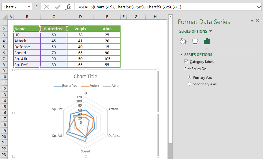
Right-Click (Context) Menu
Right-clicking an element will display the contextual menu, where you can modify basic element styling like colors, or you can activate the side panel for more options. To display the side panel, choose the option that starts with Format. For example, this option is labeled as Format Data Series… in the following image.

Chart Shortcut (Plus Button)
In Excel 2013 and newer versions, charts also support shortcuts. You can add/remove elements, apply predefined styles and color sets and filter values very quickly.
With shortcuts, you can also see the effects of options on the fly before applying them. In the following image, the mouse is on the Data Labels item and the labels are visible on the chart.

Ribbon (Chart Tools)
Whenever you activate a special object, Excel adds a new tab(s) to the Ribbon. You can see these chart specific tabs under CHART TOOLS. There are 2 tabs - DESIGN and FORMAT. While the DESIGN tab contains options to add elements, apply styles, modify data and modify the chart itself, the FORMAT tab provides more generic options that are common with other objects.

Customization Tips
Preset Layouts and Styles
Preset layouts are always a good place to start for detailing your chart. You can find styling options from the DESIGN tab under CHART TOOLS or by using the brush icon on Chart Shortcuts. Below are some examples.
Applying a Quick Layout:

Changing colors:

Update Chart Style:

Changing chart type
You can change the type of your chart any time from the Change Chart Type dialog. Although you can change your chart to any other chart type, in this example we’re going to focus on Pie chart variations.
To change the chart type, click on the Change Chart Type items in Right-Click (Context) Menu or DESIGN tab.

In the Change Chart Type dialog, you can see the options for all chart types with their previews. Here, you can find other pie chart types like Radar with Marker and Filled Radar variations. Select your preferred type to continue.

Switch Row/Column
By default, Excel assumes that vertical labels of your data are the categories, and the horizontal ones are the data series. If your data is reversed, click Switch Row/Column button in the DESIGN tab, when your chart is selected.

Move a chart to another worksheet
By default, charts are created inside the same worksheet as the selected data. If you need to move your chart into another worksheet, use the Move Chart dialog. Begin by clicking the Move Chart icon under the DESIGN tab or from the right-click menu of the chart itself. Please keep in mind you need to right-click in an empty place in chart area to see this option.
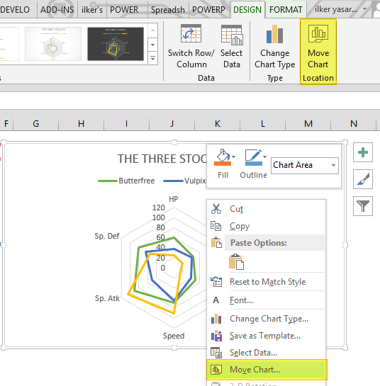
In the Move Chart menu, you have 2 options:
- New sheet: Select this option and enter a name to create a new sheet under the specified name and move your chart there.
- Object in: Select this option and select the name of an existing sheet from the dropdown input to move your chart to that sheet.