What is Regression Analysis?
The regression analysis is a statistical method that can estimate the relationship between two or more variables. This method can provide a better understanding of how the value of the dependent variable changes, when one of the independent variables change. The analysis assumes that other independent variables remain constant when running the calculations for working a variable.
In essence, a dependent variable is the outcome you are trying to analyze and predict, whereas an independent variable, also known as regressor, is the inputs that affects the dependent variable(s).
Regression analysis can be done using various techniques. Excel can solve linear regression analysis problems using the least squares method. Linear regression method assumes a linear correlation between independent and dependent variables by the formula;
y = bx + a
- y: dependent value
- x: independent value
- b: the slope of the regression line
- a: Y-intercept, a point where the regression line intersects the y-axis
In this article, we're going to be using a sample data set to go over different methods. You can download the workbook below.
In Excel
You can create a regression analysis in Excel using any of these three methods:
- Analysis ToolPak add-in
- Formulas
- Regression Graph
Analysis ToolPak
The Analysis ToolPak add-in is a very useful tool that shines in data analysis. It is a ‘hidden’ add-in, meaning that it’s not active in Excel by default. You can activate it from the Add-Ins dialog. To actiave it, follow these steps:
- Go to FILE > Options > Add-Ins.
- Select Excel Add-ins in the Manage dropdown and click the Go
- Select the Analysis ToolPak and click OK.

Add-in will be placed under the DATA tab with the name of Data Analysis after activation. Begin by going into this dialog. Here, select the Regression option and click the OK button to open the Regression dialog.

In the Regression dialog, you need to specify the references of ranges containing the X and Y values. The X and Y values are independent and dependent variables respectively. To build a multiple regression model, use two or more adjacent columns for independent variables (X).
Before clicking OK button to create analysis output, let’s go over the other options in the dialog:
- Labels: Check whether your data has titles in the first row.
- Constant is Zero: Check whether dependent value should be equal to 0 when the independent value equals 0.
- Confidence Level: Check and modify the percentage value to apply a custom confidence level.
- Output options: Choose where analysis is to be placed.
- Residuals: Check the residual values (the difference between the predicted and actual values you want to see in the output). Plots will also give you a chart.
- Normal Probability Plots: Check to see the normal probability information to the regression analysis results on a chart.

Excel will generate multiple tables and charts based on the options you choose. These tables are placed under 3 sections:
- Summary Output contains basic statistics about regression, ANOVA (analysis of variance) information, and information about the regression line.
- Residual Output shows you how far away the actual data points are from the predicted data points.
- Probability Output contains the normal distribution of regression analysis results.

Note: Even though the Regression tool in the Data Analysis can provide an analysis of the results, it is not dynamic, and you have to open the Regression dialog every time when using a new set of data.
Commonly Used Formulas
You can use formulas to reach certain values when performing a simple regression analysis. Excel’s statistical functions like these will provide useful when creating reports:
- LINEST
- SLOPE
- INTERCEPT
- CORREL
Let’s go over each of these functions and see how they work on a few examples. The LINEST function calculates a straight line that best fits your data using the "least squares" method, and returns an array describing that line. It takes 4 arguments, two of which are the array of values that contain the independent and dependent variables. The remaining two arguments are optional TRUE/FALSE arguments for the Constant is Zero assumption, and if additional regression stats are to be calculated.
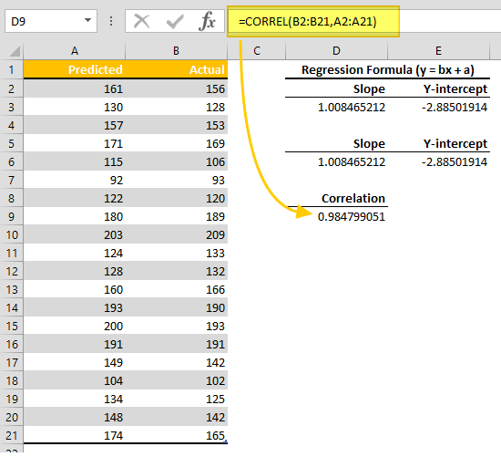
Using a function with X and Y values will return slope and Y-intercept values of the regression equation y = bx + a. To return both values, you need to select 2 adjacent cells, and press the Ctrl + Alt + Enter combination when entering the formula.
For example,
=LINEST(B2:B21,A2:A21)

Note: These results are the Coefficient numbers in the Summary Output of Regression tool.
The SLOPE and INTERCEPT functions return the same slope and Y-intercept values. If you do not want to use array functions, you can use these functions instead. Aside from the LINEST, these functions do not have any other optional arguments.
=SLOPE(B2:B21,A2:A21)

=INTERCEPT(B2:B21,A2:A21)

The CORREL function returns the correlation coefficient of two arrays. You can use the correlation coefficient to determine how strongly the two variables are related to each other. This value can also be shown in an analysis created with the Regression tool. This coefficient is named Multiple R.
You can generate residual values using the slope and Y-intercept. Based on the y = bx + a formula, you need to multiply the slope with the X value, and add the Y-intercept. The difference between the actual Y and predicted Y gives the residual value.
Assume that we call the slope and intercept values “slope” and “y_intercept”. Our formula for the first predicted value becomes:
=A2*slope+y_intercept
The formula to find the difference between predicted and actual value would be,
=B2-G2
We then copy down both formulas to generate the values for each value in our data table.

Regression Graph
Visualizing data is one of the easiest way to identify outliers and compare multiple elements. Excel versions 2010 or newer support Trendlines. This is a powerful tool that can show the regression between two series without any calculations.
Make sure that the independent variables (X) are on the first column, and dependent variables (Y) are on the second. Then, select your data table to start creating a chart.

Create a Scatter Chart from INSERT > Scatter (Charts)

Add a linear Trendline by using the plus sign next to chart, or right-click a data point.

The trendline formula does the same thing as the Regression tool and Formula methods. You can also improve the looks with few modifications. Double-click on the trendline to open options pane.
You can add an Equation Formula and R2 values to the chart by enabling the related options in the Format Trendline menu.

You can also modify the chart properties like the color of the trendline, the chart and axis titles, and axis formatting from the same menu.