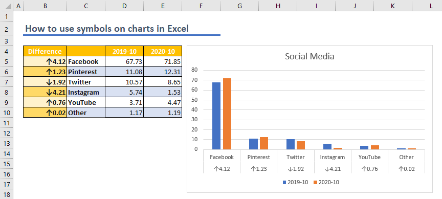
Adding symbols or icons into charts can enhance the visual representation, and make it easier to understand the data. In this article, we are going to show you how to use symbols on charts in Excel. Adding symbols to Excel Note that you can always copy a symbol from...
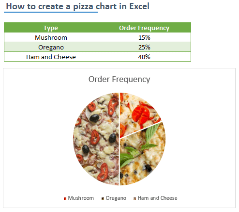
Of course, there isn’t a chart type called a pizza chart in Excel. On the other hand, Excel has a support for inserting images into chart elements. With help of this cool feature, you can give your charts a fancy look. In this article, we are going to show you how to...
A thermometer chart is an effective way of comparing two values. Although Excel doesn’t support this specific chart type, there is a way to create a thermometer chart. In this article, we are going to show you how to create a thermometer chart in Excel. Download...
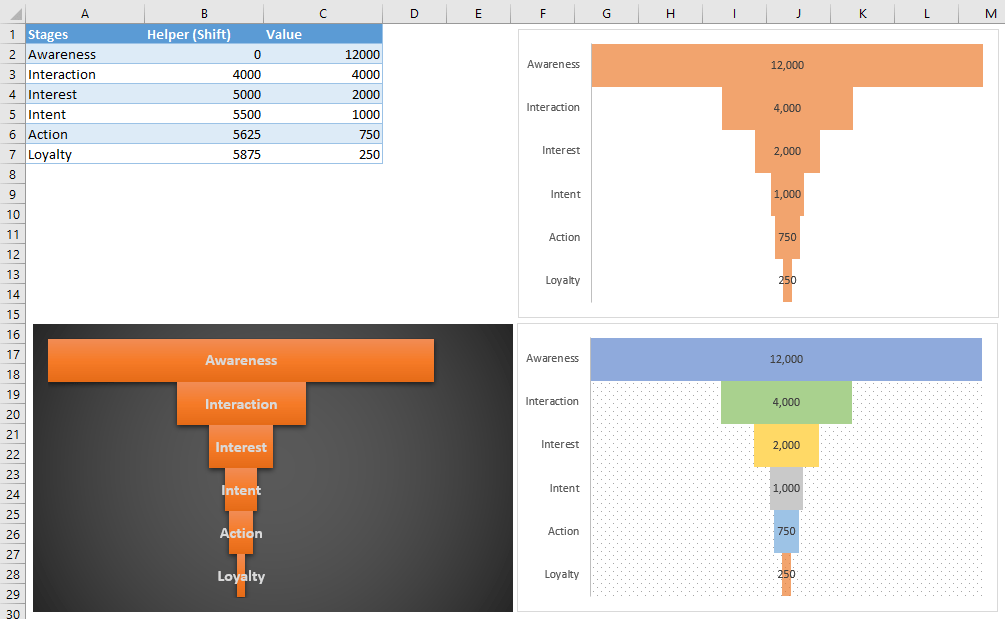
In this article, we are going to show you how to create a Funnel chart in Excel versions older than 2019 – including 365. Funnel charts are fairly popular among sales and marketing processes. You can use a funnel chart to display the progression of data through...
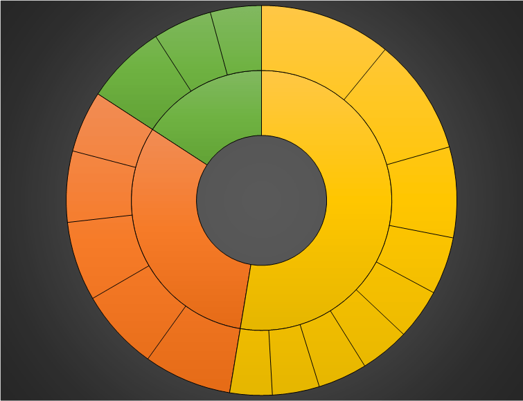
A sunburst chart is a type of visualization that – just like treemap charts – works great for displaying hierarchical data. A sunburst chart is drawn in a circular layout where each ring represents a level in the group hierarchy. While the inner ring...
Charts are a staple in creating dashboards and reporting. It’s only natural that Excel supports many chart types with various features. The ability to save templates is very useful for quick access to frequently used chart types. In this guide, we’re going to...
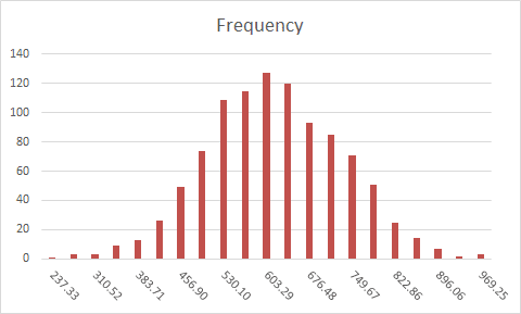
A histogram is a visual representation of the distribution of numerical data. Grouping data into specific percentiles can give you a better overview of the big picture. You can create an Excel histogram in two ways:Using formulasAnalysis ToolPak add-in Excel Histogram...
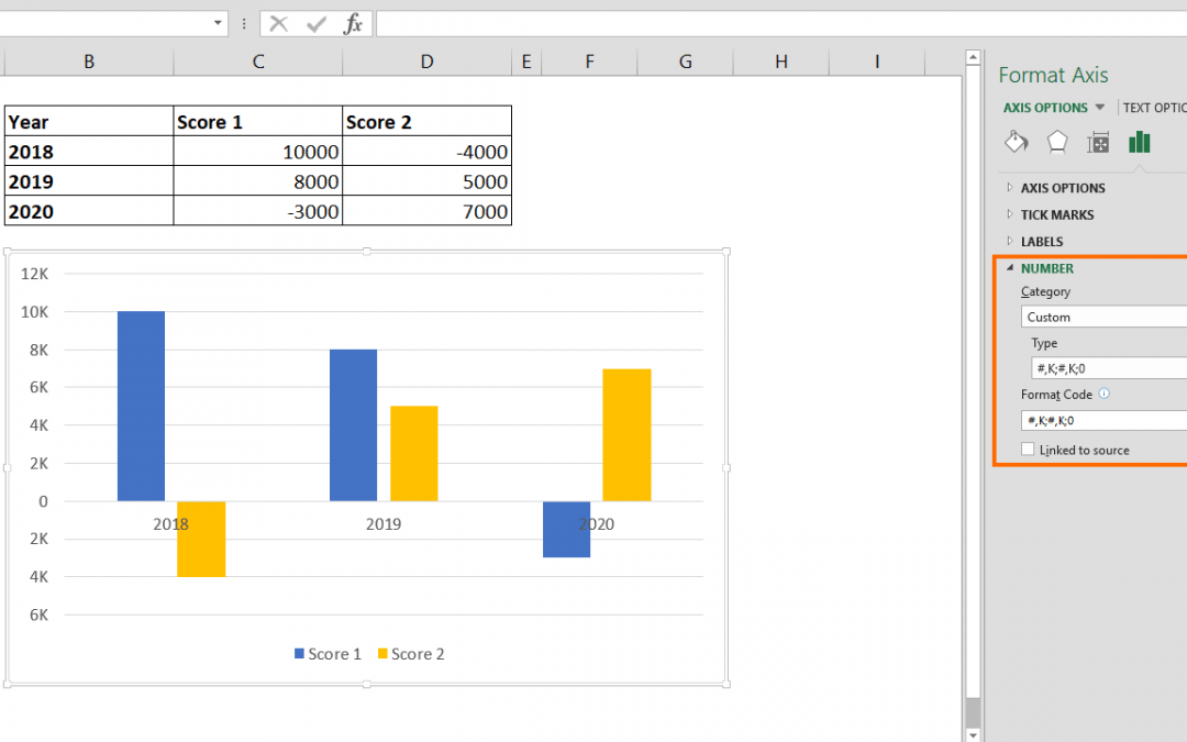
Excel charts are one of the most used and easy to understand data visualization tools. Excel provides many chart types as well as numerous personalization options. One of the cool features is the ability to change number format in Excel chart. Steps Double-click on...